Turning a piece of pottery upside down and seeing a neat, formal foot enclosing the potter's mark , combines the pleasures of handling the shape and weight of an object with the gentle thrill of seeing a familiar potter's mark or, finding an unknown maker has left a clue, at the very bottom of the pot, a secret, intimate sign linking the maker and the user. The foot is an essential part of this pleasure as it contains the final piece of direct communication between the artist and the user of a pot.

When I was down at the ANU last week Micheal Keighry and I had a talk about form. I've been wrestling with the idea of footed or unfooted forms for some time. The footed forms place a pot firmly in a tradition creating a tension with the drawing which is abstract and contemporary. The small forms really work with a foot. As the pots get larger the foot stops raising the pot from the surface on which it sits in a dynamic way and starts drawing the eye towards itself in a a self-conscious near parody of traditional Japanese shapes. Why is this?


There is something I really love about footed bowls. It is a potter's thing. The foot on a thrown bowl talks about process and tradition. There is a need for thrown bowls to be footed when they are decorated raw. It is very difficult to turn unfooted bowls over in order to decorate near the bottom edge of the vessel. A foot provides something for the potter to grab onto. I also love how the foot adds an alert, exclaiming posture to the pot. I feel that throwers are often asked to erase marks of making such as throwing lines, turning lines, feet. The wheel is a humble, industrial machine from the lower echelons of the industrial spectrum, often signs of the craft of throwing are seen as a distraction or something inadvertent and ugly that should be erased. For me the turned foot is a celebration of the thrower's skill, anyone who has ever thrown pots on a wheel knows the pleasure of a fine turned foot, it is a piece of communication between me and other throwers, an affirmation of my love for an underrated craft yet to fulfill it's creative potential.


 Turning a piece of pottery upside down and seeing a neat, formal foot enclosing the potter's mark , combines the pleasures of handling the shape and weight of an object with the gentle thrill of seeing a familiar potter's mark or, finding an unknown maker has left a clue, at the very bottom of the pot, a secret, intimate sign linking the maker and the user. The foot is an essential part of this pleasure as it contains the final piece of direct communication between the artist and the user of a pot.
 When I was down at the ANU last week Micheal Keighry and I had a talk about form. I've been wrestling with the idea of footed or unfooted forms for some time. The footed forms place a pot firmly in a tradition creating a tension with the drawing which is abstract and contemporary. The small forms really work with a foot. As the pots get larger the foot stops raising the pot from the surface on which it sits in a dynamic way and starts drawing the eye towards itself in a a self-conscious near parody of traditional Japanese shapes. Why is this?


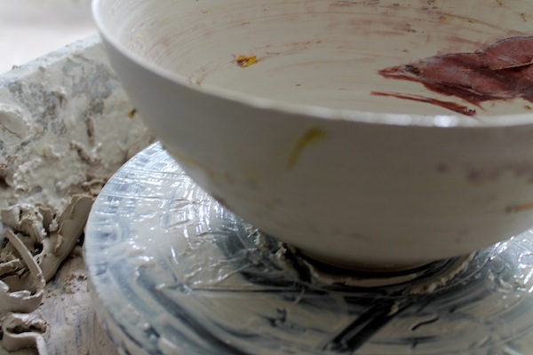
 Bush combings are soaked in iron oxide and yellow glaze stain and thrown onto the pot after it has been pulled up twice.